Design Dilemma Friday- Honey Oak Cabinets


Photos: www.astonephoto.com
It’s that time! Where I choose from one of the questions that has been sent and tackle a design dilemma that has you stuck in your process.
QUESTION:
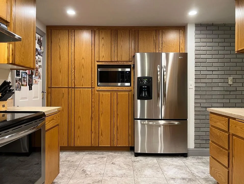
“Ok here’s my question: do you see honey oak cabinets coming back into style any time soon???? I have really nice quality custom cabinetry that was installed probably about 25 years ago, and it’s killing me. How do I embrace it!”
While oak is definitely current, and warm woods are quickly making their way back in 2024, that distinct honey oak stain popular in the 80s and 90s, still strikes a bad chord with many of us. Because of this, I think it will be quite some time before that style is fully accepted into mainstream kitchen design. Of course you can choose to paint them or re-stain them, but that is a large investment of research and time. It’s just not a quick easy job and it’s hard thing to reverse if you’re unhappy with it. So that leaves us exploring what other options you have…and don’t worry, you’re not alone in the struggle.
OTHER IDEAS:
PAINT - You really have two options for how to approach paint in this kitchen. You could choose a paint with warm creamy undertones, so as to blend in with the undertones in the cabinets, creating a harmonious and analogous color palette. This would draw less attention to the cabinets specifically because the whole space would feel warmer overall. OR you could choose a paint color with blue/green undertones. These are more complementary and contrasting with the undertones of the cabinets. So it would actually intensify the undertones in the cabinets but also cool down the warmth in the room overall by balancing out the cabinets.
For this room specifically, I would lean toward bringing in the blue tones because there is SO much wood, and thereby orange/yellow, that it desperately needs to be put in check with another strong statement. I would lean more blue over green because green reflecting on your food can be off-putting, so it’s not great for a kitchen. One final note on this, is if you’re bringing in the blue color, I would make the trim color a light white to coordinate, rather than the current gray.
Some blue/green paint colors to consider:
Wythe Blue Benjamin Moore
Rain Washed Sherwin Williams
Tradewinds Sherwin Williams
Pleasant Valley Benjamin Moore
Upward Sherwin Williams
What I can’t tell is how far the wall extends into other areas and whether there is a natural stopping point to the paint. If not, I would opt for doing the walls in a creamy light neutral and bringing the blue in another way. (See next option)
Creamy neutral paint colors to consider:
Classic Gray Benjamin Moore
Collingwood Benjamin Moore
Oyster bar Benjamin Moore
Pale Oak Benjamin Moore
West Highland White Benjamin Moore
White Dove Benjamin Moore
ELIMINATE THE 90s- Other than the cabinets themselves, the other 90s element I see contributing to the datedness of the kitchen, is the countertop and 3-4” backsplash. I would definitely change this to a different countertop and use the opportunity to put a blue/teal toned tile backsplash fully between the counter and bottom of upper cabinets. Leave your countertop a light neutral so your beautiful blue backsplash can be the star in combating the wood. It will cost some money but nowhere near the cost of replacing cabinets and will completely change your kitchen.


BREAK UP THE WOOD- Another reason this feels overwhelmingly “honey oak” is because there is SO much cabinetry. It literally wraps around the entirety of the space, making you feel like you’re in a wooden cocoon. I would try to find an opportunity to break up the wood. The easiest way I see to do this is by removing the cabinets on either side of the window and replacing them with open shelving. This would make it visually lighter and feel bigger. Because I can’t see exactly how they are built, I’m not certain this can be done and it would take some woodworking skills. It would also offer a beautiful focal point, a space where you can add pieces with character and texture, give your eye a rest from the wood, AND allow your beautiful blue tile to be carried up to the ceiling in that spot.
The other way I see to do this would be by removing the cabinet over the range and replacing just that section with a vent hood of a different material, shape or color. Again the blue tile could go up higher at this point which would contribute variety and interest to the entire area.
LIGHTING- You may also consider our lighting. I can’t tell from these but if you have very yellow lighting, that could be contributing to the overall yellow/ orange feel. You might try a slightly bluer kelvin temperature in your light bulbs and see if that tones things down in a way that you like. It’s not always a huge change but it might be enough to help you like your cabinets more.
OTHER NOTES- Your brick wall could be a really interesting feature. Making it darker like you have draws attention to it, but there’s nothing there to really draw attention to. I’d consider maybe putting up some artwork, a gallery wall, or maybe an herb wall if it gets light and the walkway is wide enough. Something to make it worth the attention it’s getting. Depending on what shade of blue you bring in the kitchen, you could make this brick wall a more striking and saturated version of that also.
One last thing you could do to really make things look finished here would be adding a trim kit to your microwave. It’s a small detail but I think you’d be surprised how custom and complete it looks. There are companies that will make it for any microwave if you give them the measurements and they’re not very difficult to install. It’s definitely worth looking into.


